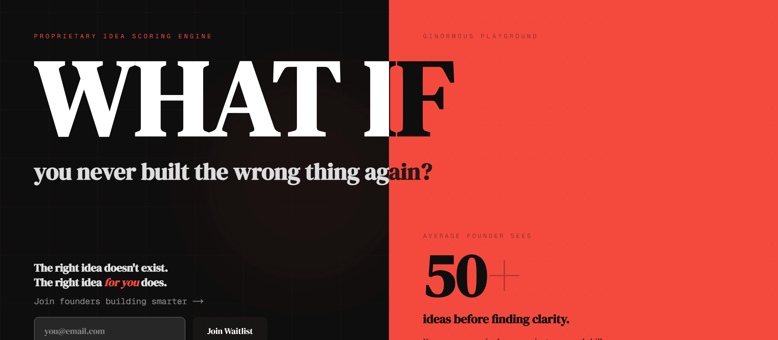
I rendered 16 fonts on a real landing page and the plain one won
I needed to pick the headline font for the hero of Ginormous Playground, a landing page I'm building. The honest way that decision usually goes is a half hour of squinting at font names in a dropdown, picking one that sounds interesting, shipping it, and deciding two days later it was worse than what I had. None of that involves looking at the actual font in the actual hero next to the actual split-color layout and the giant "WHAT IF." So I stopped doing it that way.
The bet is simple and falsifiable: you make a visual decision faster and better by seeing every option rendered in the real running app than by judging them in isolation or in your head. The cost is a throwaway selector you build once and delete after. If that selector takes longer than the indecision it replaces, the bet loses.
The one decision: inject the options into the real app, not a mockup
The core move is to not evaluate options anywhere except where they will actually live. No swatch board, no Figma frame, no isolated /preview page with gray boxes. You wire each variation into the real hero behind a ?option=N URL param, drop a tiny dev-only pill that cycles them, and serve locally. Every candidate gets judged against the real headline copy, the real color split, the real neighbors, the real responsive width. This is the serveoptions pattern from workways, and it is the whole idea.
For the font case: each option sets one CSS variable that the real hero already reads, so the giant headline and the cycling subhead both restyle at once. The pill writes ?option=N into the URL so a specific pick is shareable and deep-linkable. It renders only in development, so it can never leak into a production build.
That clip is the actual decision happening on the real hero: sixteen headline fonts cycled in place, each one sitting in the live layout for about a second. I recorded it headless with Playwright (one Chromium context with recordVideo on, click the pill on a timer, close the context to flush the file), no screen, no human at the keyboard. The how-to for that is its own post, and the script lives in the pr-screenshots cluster's headless-webm.md.
The cost, measured
Sixteen candidates, judged in a couple of minutes, zero shipped-then-regretted. Wiring the options was one CSS variable plus an array of font choices. Cycling them and reading each in context took seconds apiece. The expensive part of font selection was never the rendering, it was committing to one without seeing it in place, and this deletes exactly that cost.
The wrong prior: I was sure a fancier font would win
Here is the part I did not expect. Going in, I assumed I'd pick something with personality: a high-contrast serif, the loud rounded display face, the ultra-condensed poster font. The plain geometric sans the hero already used felt like the safe, dull choice, and a landing page is supposed to have presence.
Seeing all sixteen in place killed that story in about ninety seconds. Against the hard black-and-red split and the already-enormous "WHAT IF," the characterful fonts fought the layout for attention and lost. The plain sans let the composition do the talking and read best. The serifs looked like a magazine, the condensed face looked like a sports poster, and neither was the product. If I had picked from font names in a dropdown I would have chosen wrong and felt clever doing it. Looking at the real thing is what corrected me, and it only works because the options were rendered where they belong.
What it is and isn't
This is for decisions your eye is supposed to make in context: type, spacing, color, layout density, the shape of a card. It is not for correctness, there is nothing to assert and nothing to test. It is also not a feature-flag system or an A/B framework. It is deliberately throwaway scaffolding: you build the selector, you make the call, you strip the selector and the losing options and leave only the winner. The pill in that clip is already gone. The point was never to keep sixteen fonts around, it was to look at them once, honestly, and then stop guessing.
Take it
The serveoptions cluster is in workways, and the headless-recording method that captured the clip above is in pr-screenshots:
npx workways add serveoptions
Wire your variations to a ?option=N switch, serve it, and let your eyes do the job you were about to do with your imagination. They are better at it.